Friday, May 27, 2011

Likes and Dislikes

Likes and dislikes:
Due 30 May 2011

Any area of design:

LIKE LIKE!

 100,000 photos


I found this image here
I love this bridge. I like the way its quaint an charming. The curvy, restful feminine lines used to design it allow it to blend in with the surroundings. The light cream color of the complements its design. I also like the delicate carving on the wood..it just serves to enhance the whole design.

Dislike:


I don't like the design of this bridge, the straight, diagonal lines used to design it lend it a more masculine feel that I don't really go for. It also has more angles than as opposed to the curves in the previous bridge. I do appreciate that it looks quite sturdy though, it looks like it serves its purpose. :)
I found this image here.

Jewellery designs

Like:


Absolutely beautiful..This pair of earrings was designed and made by Flower Designs. They specialise inn handmade flower jewellery. I really love this pair. You don't usually find metal this color combined with a delicate pretty design, and even the colors. I don't usually like purple put together with gold but somehow in this design ,the designer managed to find a pleasing balance in the color tones used and in the saturation of the colors. Would totally wear this one..:) I found this here

Dislike: 
Aquila Earrings
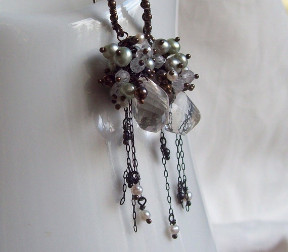
I am not excited about this design. It has too much on it for my liking. Its starts to feel as though the designer could not make up her mind on what to put on the earrings. The clusters around the big stone are nice, the chandelier bit is just off. The earrings would have looked better without it. I found this image here

Thank you:) 

Sunday, May 8, 2011

Likes and Dislikes.
Due 9 May 2011

Like:


I absolutely love this brooch by Marta Mattsson. The materials used to make it comprise of a beetle, resin, yellow cubic zirconias and silver. I enjoy the way the colors just seem to compliment and blend with each other..I am not usually a fan of creepy crawly things and to me the beetle falls in this category but  the resin around it just seems to augment it.  The silver gives a nice contrast to the warm colors. I found this at www.klimt02


Dislike:
I find this ring rather repulsive. The bird's head is rather big and the  coloring of the ring is too dark for my liking and the way the eye sticks out gives it a rather sinister feel. I do appreciate that it must have taken some level of skill to make the such an accurate representation of this particular bird. I  found this image here
 Other areas of design..:

Like:

 talk about a nice welcome...a handshake even  before you open the door.. I like this design because of the humor behind it..and that its not your typical doorknob. It might be just a little ridiculous really but we all need a bit of silliness here and there.. :) I found this image here

Dislike:


I  do not like this design. I get a feel of eeriness, this is mainly caused by the choice of coluors for the room and some of the items used to design it like the smoke, the picture on the wall that looks like a dragon's lair..Its too cheerless and dark for me. I appreciate though that it took some creativity to create this look and someone who is more inclined to a Gothic look would appreciate it. Not for me though. i found this image here.

Sunday, April 17, 2011

Likes and Dislikes due 18 April 2011

Jewelery:


Likes:


I really like this ring. It has a an interesting mixture of different shades and tones. The line used here has a fascinating effect. The designer used curvy organic line to create a rather mesmerising effect because your eyes are drawn around the whole ring. The gold "balls" are a nice touch as you would tend  to expect to see a gemstone there because of the amount of gemstones on the ring.


Dislike:
 

I absolutely dislike these earrings. They seem overdone somewhat. The designer used a very warm colour for the metal and the stones are also a very hot color. Its comes across o me as too bright and it ends up looking  rather cheap. Had the designer thrown in a few cold colours...for example green here and there the overall effect of the piece would have been better. I found this image here

Other areas of design:

Like:


This is an experimental rolling house..It shifts to create different spaces(bed,kitchen,seat etc) as you "roll" it. which you do just by walking. I like it..its innovative and out of the box. Who said houses had to be stationary? :) Its is also sort of dual purpose in that you can exercise and move your house at the same time...Nice thought for those of us who hate getting out of the house to go to gym..:) I found this image here


Dislike:

 
Really..? I thought the point of wearing shoes was so that one does not go barefoot...? Whilst I find this shoe creative, I also find it totally impractical..The heel is definitely not made for walking..It looks uncomfortable and way unbalanced..I don't like it. The point at the end of the heel looks like it might cut into skin..The silver horn combined with a black colour also makes it look somewhat sinister to me...I found this image here

Monday, March 21, 2011


Like and dislikes

Due 28 March 2011

Jewellery Designs
Like:

I love these rings..Not only are they unusual but the way they are made is intriguing. The way the stones on the rings allow light to shine through is fascinating. It seems to change the whole "character" of the ring..Like comparing the ring with black stone and the one with green stone. The designs are similar but the colour of the stones on the ring make them look different..It seems to me that even the texture of the metal looks different. The way the metal seems to be  laid onto is appealing because usually its the stone on the metal.. Reference: I found this image here

 Dislike:

This piece of jewellery was aptly named "Vertebrae" by its designers. It is made of glass filled nylon.. I find it completely distasteful to say the least. It is too reminiscent of a culture that defines beauty as bones that stick out. It makes the wearer look deformed.. The way the jewellery resembles bones makes it downright unattractive for me.. And yet in another way I find it clever and really creative..and I realise that it must have taken some level of skill to create..
 Reference:I found this image here


Other areas of Design:

Like:

curtain designs,curtainscurtain designs,curtains

The pictures above are of magnetic curtains...They can be shaped into almost any shape whether they are opened or closed..I love the idea because I easily get bored with same thing day after day.. I can just imagine the several ways in which I could fold the curtains and create a new effect.. :) I also like the design because it is innovative and yet simple. Its versatility holds the greatest appeal for me.. The colours used on the curtains are neutral allowing you to work with the curtain however you want..
I found these images here.

Dislike:


This is a design for a bed...I find it really impractical and rather narrow minded...Obviously very few people sleep in one position all night long..I think it would be really uncomfortable and its not necessarily functional because beds are supposed to be comfortable.. On the other hand though one could argue that it is a humorous design and is on some level creative but I don't like it..I mean when it comes down to it you want to sleep  comfortably right..? :)
I found this image here

Tuesday, March 1, 2011

2 Designs: 1 March 2011

Like:
Carpet and slippers?!:
LOL!! :) Honestly who thinks of such things?? Unusual as this might be..I love and I find it totally practical in an impractical way.. The colour is neutral, it doesn't show dirt quickly..The texture is one I would have to feel first before commenting decisively because it looks like it might be slightly uncomfortable underfoot. Otherwise both the slippers and carpet look comfortable with the thick padding..and there are enough pairs for family and visitors alike so you wouldn't have to worry about people tracking dirt all over your carpet.. :)
I found this: here

Shoes seem to be the theme for this one..

Dislike:
Rat shoes:
I hate rats so obviously this doesn't take the cup..It is an interesting design though, but I cant seem to understand the logic behind it..but then again design doesn't always have to be backed by logic..And speaking on scared behalf of those who are scared of rats..they not the first thing you want to see in the morning..The "tail" looks long and might cause you to trip.. For a "rodent-lover" these could be ideal..the design has positive aspects though..The head of the rats looks like it provides thick padding for the toes which can be pretty handy if u wake up and get up whilst you are still bit disoriented..The rats also look really lifelike..and the "fur" makes the slippers warm..Found this here

Jewellery Designs- 1 March 2011


Like:
Antique necklace.brooch and earrings:


I love this set...It has a leaf design and I like organic shapes and textures. The material used enhances the design. The leaves look almost real..The necklace does not look that comfortable to wear though, it does not look like it would sit well around the neck..Maybe because the leaves continue right around so I tend to  find myself wondering how its going to sit like by the sides..its metal so its not like its going to stick out..Oh actually maybe I am thinking of it wrong..because it could be that the designer used little rings to link the leaves so in that case they would be "flexible"and the problem of not sitting on the neck would be solved..If only  I could hold it in my hands...The earrings and brooch are just perfect..they developed the theme in different ways that blend..the flowers and the different leaf design on the brooch..
Ref: I found this here

Dislike:
 Antique Ring:
I find this ring quite creative..It looks like it was designed for someone of importance a Lord or something..It definitely has a masculine air about it..There is something about the design that comes out as too strong..I think the way the ring bend is slim then the design on top is rather big AND has a large stone-(well the stone is large in comparison to the rest of the decorations on the ring except the teardrop "mound" that its in of course)  The overall effect is distasteful to me. I don't like it although I can appreciate certain elements of it. The decoration on  the top side of the ring would have probably looked better as a pendant on a matching chain..
Ref: here

Artist Statement

Chic without being ostentatious is my general style..I like simplified elegance..Since jewellery is an expression of who you are, most of my inspiration stems from organic shapes and textures, astronomy and natural light effects such as moonlight on a lake etc... I  enjoy bringing out the ethreal effect....if you can visualize  it there must be SOME way to make it..